Color Matching

One of the most common problems people have when dealing with their wardrobe lies in knowing what colors go together. Will this blue blouse work with this orange skirt? Can I pair my maroon Capri pants with a yellow blouse? (For the record, the answers to the above questions are "No" and "No".) The concept of color matching is one that some people seem to have no ability to get a handle on, while others seem to have a sixth sense about it.
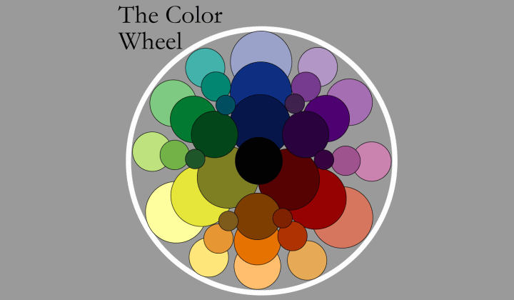
However, the concept behind color coordination is simple: colors have natural associations that either strengthen or soften them. This is based on the color wheel - the graphic representation of the way colors are formed - and once you understand the color wheel, combining and matching colors into pleasing pairings becomes easy. Well, maybe not "easy" but much less mysterious.
Every color can be broken down into combinations of two of the three primary colors, plus lightness and darkness, reflecting the intensity or faintness of the color. The three most basic colors - the primary colors - are red, blue and yellow. The addition of light and dark to these give us shades from robin's egg blue, pale pink, and butter yellow, to lapis lazuli blue, blood red, and sunflower yellow. It is from these primary colors that all other colors are formed.

When you mix any two primary colors in equal measure, you get a secondary color. Mixing red and blue creates violet. Mixing blue and yellow creates green. Mixing yellow and red creates orange. Adding measures of light or dark to these colors creates varying shades of the colors as well.
Tertiary colors are created by mixing a secondary color with its adjacent primary color. For example green can be mixed with blue or yellow to create blue-green or yellow-green; orange can be mixed with red or yellow to form red-orange or yellow-orange; and violet can be combined with blue and red for blue-violet and red-violet. By adjusting the amounts of the primary colors with the levels of lightness or darkness in the color, you can create any shade of color found in our universe.
Learning at least the basic layout of the color wheel is important for matching colors because doing so allows you to understand the relationship of these colors. Once you understand the relationship of the colors, you will be better able to determine how well these colors will work when paired with one another.
Color Relationships
Now that you understand the color wheel and how colors are formed from the primary colors you can understand the two basic relationships we talk about when we look at matching colors. Primary and secondary colors that sit side-by-side on the color wheel are considered to be Analogous to one another. (Example: Blue's Analogous colors are green and violet, while orange's Analogous colors are red and yellow.) Analogous colors tend to work well with one another and often have the effect of causing each color to appear subdued.
Primary and secondary colors that are positioned opposite one another on the color wheel are considered to be Complimentary colors. Blue is Complimentary to orange. Violet is Complimentary to yellow. Red is Complimentary to green. The reverse is also true for these pairings. Complimentary colors are named such because the colors they compliment appear to stand out and seem bolder than either color appears separately.
Analogous colors make good choices for color matches when they are matched according to the levels of light and dark present in the respective colors. Complimentary colors can be paired when the goal is to create a bold statement. However, matching complimentary colors is a very tricky business. Certain shades of complimentary colors will not look good together, while some shades of complimentary colors can look better than either color looks on its own.
Finally, lighter and darker shades of the same color can often look good when matched, forming a monochromatic effect.
Specific Colors and Matching Guidelines:
Matching Reds
Matching Blues
Matching Yellows
Matching Greens
Matching Violets
Matching Oranges
Combining Patterns
Matching Black and White
The idea behind color-matching is to pair colors that will flatter one another, or be pleasing to the eye when combined. By using the rules above, you can be assured of making better choices in combining the colors of clothing in your wardrobe. The result will be a better looking you in whatever situation you find yourself.
©Greatestlook.com
Photo: Syda Productions/Shutterstock
Related Posts:
Color types
Color and its influence